We all want to jump straight in and start coming up with ideas, but there are a few steps before you can get into the fun part of livery design.
Get the brief!
To start with you have to be sure that the brief you have received from your client is detailed. I always start with asking the client questions such as, what is the purpose of the livery and what do you expect to get out of it? There will always be brands that are paying more than others, or that have preference, so it’s important to ask about the brand hierarchy. It’s also critical that if there are any branding guidelines that these are supplied with the brief. Where you’ll get into trouble is when you use a logo in a way you shouldn’t. You’ll often find that when dealing brand guidelines from many different brands you’ll find many contradictions and dead ends – this is the challenge of livery design. After you’ve determined what the client wants to achieve with the livery, two things I always request are; show me some liveries you love and show me some liveries you don’t. This just might help with an initial direction or idea and can save a lot of pain later if that idea who had in your head looks close to something the client didn’t like!
Logos
Now that you’ve got your brief in detail you need logos. Normally you’ll be able to grab these directly from a PDF style guide if they’re still vectors, but if not it’s important that you are able to use vector based logos. Vector graphics are infinitely scalable without losing quality which is why they are used for logos. It’s pretty rare that a logo is designed in anything other than vectors, however it can happen from time to time so just ensure you have it in the biggest format possible.
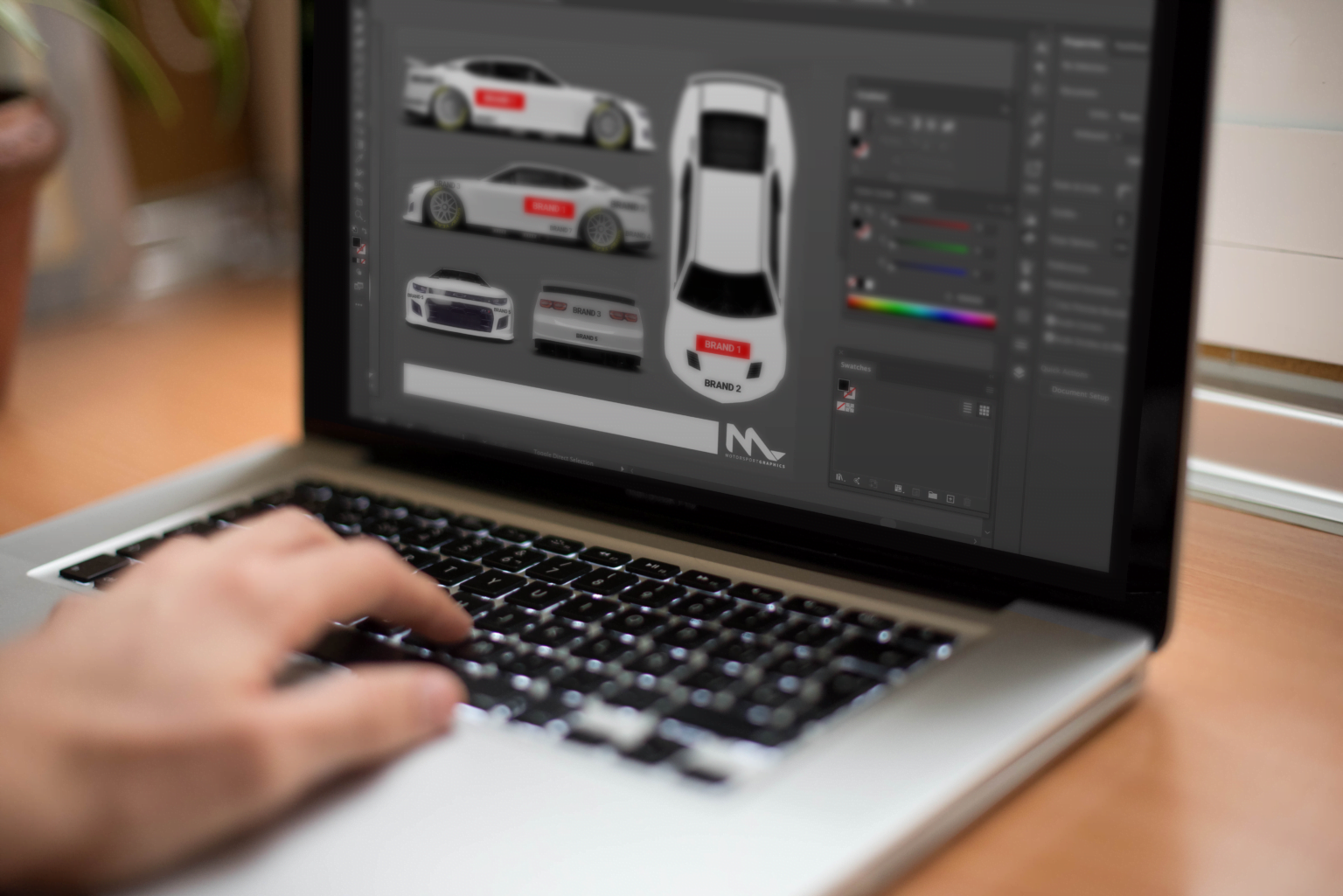
2D templates
You’re armed and ready to go with your brand assets, your brief and your 2D vehicle template. 2D vehicle template you ask?
When you are first starting out it’s best to start in 2D. Logo placement and hierarchy is really important. After all, the brand who is usually paying the most should be seen above all others, but that doesn’t mean they should be seen at the expense of the other brands. Logos should always be places on flat sections of the vehicle (within reason). Adding logos to heavily curved areas of the vehicle will often render parts of the logo illegible.
Hierarchy
Below is an example of hierarchy. There are 7 ‘brands’ used at different sizes to show hierarchy, however it doesn’t always have to be size related to draw the attention of the viewer.

Below, brand 1 and 2 are the same font size, however with the use of colour and shape brand 1 still remains the standout.

Colour
Colour choice is often dictated by the major sponsor or team colours, and often can cause issues when trying to incorporate multiple brands into the one design. Clashing colours or colours that are very close on the colour palette can often be avoided by using single colour logos and black or white (whichever offers the most contrast with the colour below). Sometimes though, brands require their logos in full colour so it’s up to you to work out a solution that works for all involved. This might mean adding white to the main livery colour palette and placing full colour logos in areas of white.
Graphics
The underlying graphics are what ties your livery design together, mixing all the different brands and their nuances into a seamless integrated design. This is actually the most fun part, but in a lot of ways the most critical. Sticking to large blocks of colour is always safe. The more detail in the graphics the more likely you are to lose focal points. You do not want to take focus away from key brands. Drift teams in Japan are notorious for their overuse of graphics and can be a good example of what not to do.


We will follow up this article with more detail on applying graphics and logos along with more tips and tricks.